APIPASS · 2025
Flow Page
Finding a specific flow meant scrolling and reading — every time. For teams who touched integrations daily, that was a tax paid on every edit.
- Role
- Discovery, benchmarking, information architecture, UI design
- Company
- APIPASS — iPaaS · Integration platform
- Focus
- Information architecture, Navigation, B2B SaaS
The problem was invisible until you had scale.
Our integration page worked fine for a customer with ten flows. It broke down for the ones with a hundred. Everything lived on the same plane: a grid of cards, sorted by last update, each one showing a name and a service count. There was no hierarchy, no grouping, no way to say “this flow belongs to checkout” and “this one belongs to logistics.” Finding a specific flow meant scrolling and reading — every time. For teams who touched integrations daily, that was a tax paid on every edit.
Explore in Figma
The Figma file includes layouts in Portuguese and English.
What users told us
Across five customer calls, the same three problems kept surfacing, phrased differently each time:
Choosing a reference
We benchmarked three players before committing to a direction. Digibee and MuleSoft both solve this problem well, but they solve it for a different user — their models assume a specialist who is comfortable with density, layered configuration, and enterprise-grade complexity. Adopting either would have contradicted the rule the platform is built on: simple and objective. We rejected them on that basis, not on quality.
Workato was the closer fit. Its project-and-recipe model gave users a mental structure without asking them to learn one, which is exactly the trade-off we needed. We took the structural idea and adapted it to the vocabulary our customers already used to describe their own operations.
What we designed
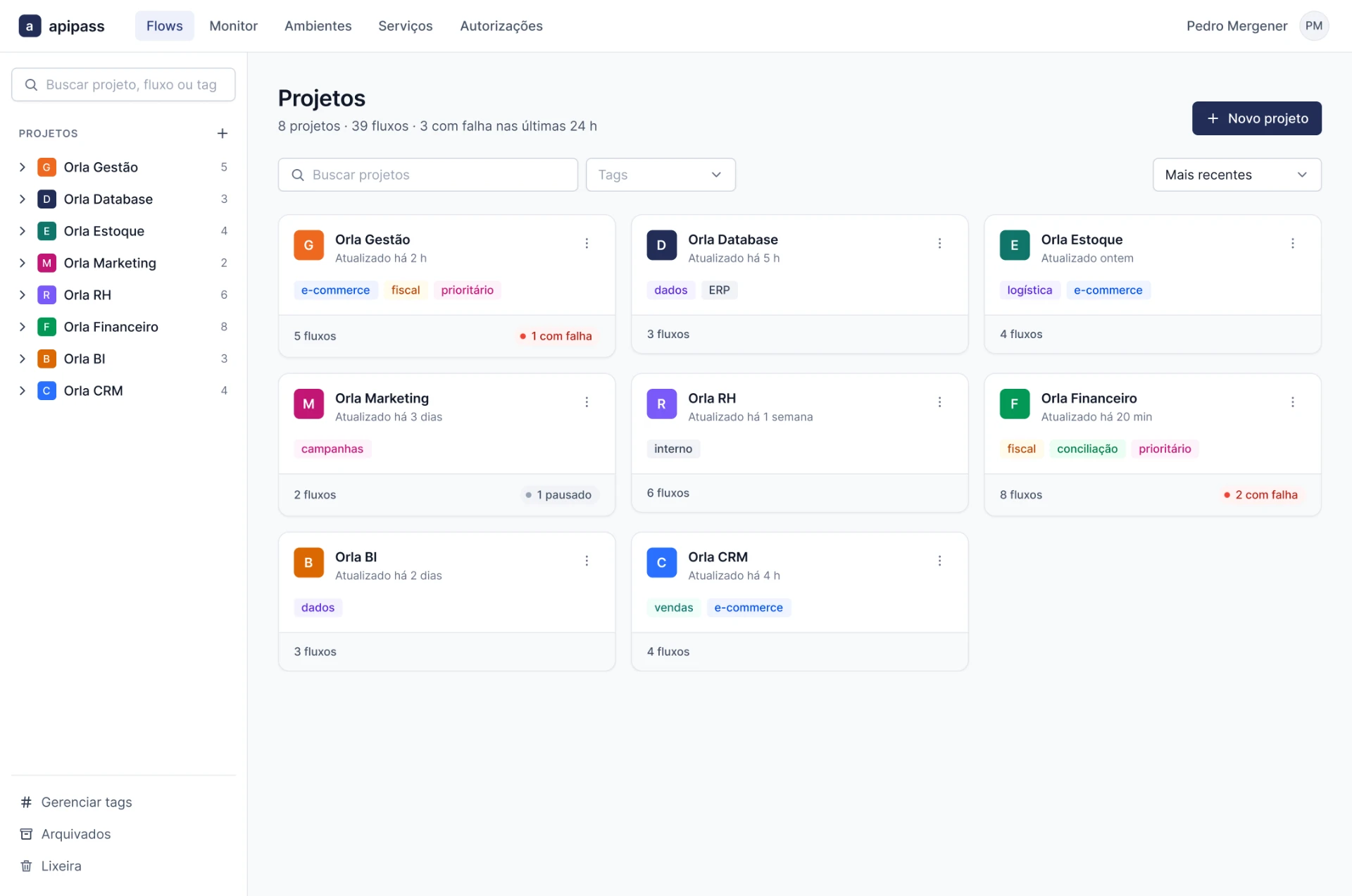
We introduced Projects as a first-class container — a grouping that maps to a real business process (checkout, logistics, registration, database) rather than to an arbitrary list. From there, each insight got a direct response:
- 01A persistent left-hand tree that lets users move between projects and drill into flows without losing their place, plus a global search across projects, flows, and tags.
- 02Tags as a cross-cutting layer, so a flow can be grouped by process and filtered by subject (e-commerce, fiscal, logistics) — the separation users had been improvising outside the product.
- 03Metadata surfaced at the flow level: description, integrations, execution volume, and environment. The card now answers “is this the one I'm looking for?” before you open it.
- 04Lifecycle actions in context, so creating, importing, archiving, and organizing happen where the flow lives instead of somewhere else.
Edge states
The outcome
Result
Reduced user search time by 35% and Flow creation by nearly 50%
Measured through a task test comparing the old and new versions with 8 users. Task: create and locate a specific flow inside a project. Tickets compared [period before] vs [period after] the release.
Feedback came fast. Users no longer had to hold the map in their heads — creating, finding, and managing an integration became something they did in a few seconds instead of a few minutes.